

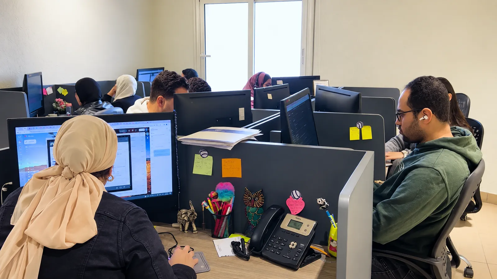



Conversion-Focused Website Design: A Practical Guide for the Gulf
How to turn your website into a sales asset: one goal per page, a message that lands in five seconds, local trust signals, speed, shorter forms and honest measurement.

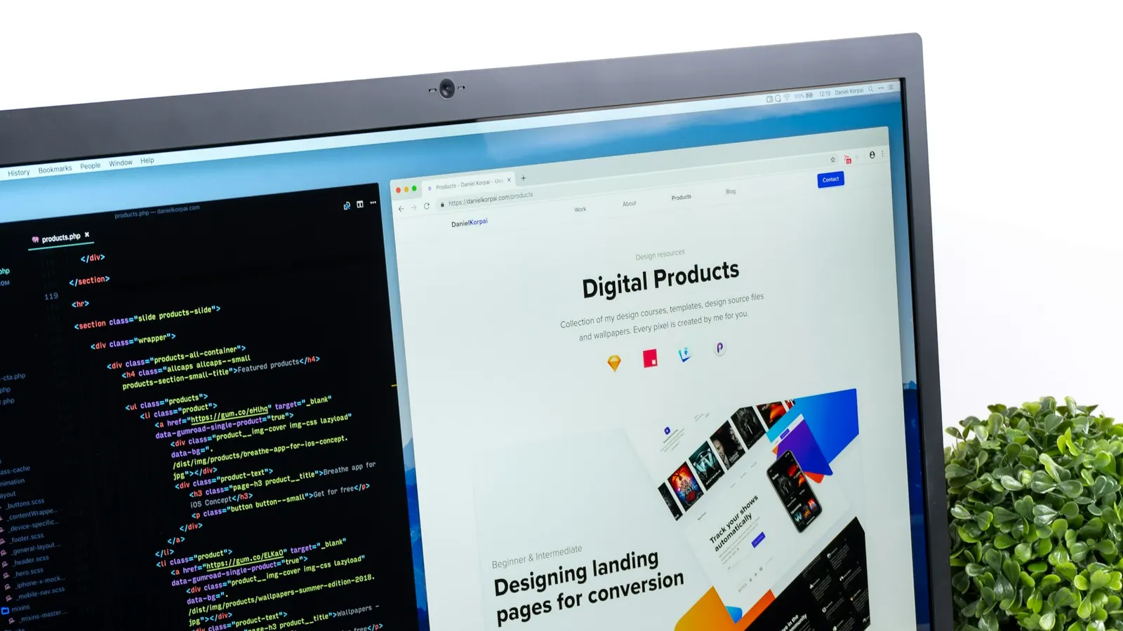
خلاصة المقال
- 01Define one primary action per page before any design work, and give it one primary button.
- 02In the Gulf, trust often decides: native Arabic content, a local number and WhatsApp, a visible commercial registration and real photos.
- 03Aim for LCP within 2.5 seconds, INP under 200 milliseconds and CLS of 0.1 or less on a mid-range phone.
- 04Count a lead when the form is successfully submitted, not when the button is clicked, and pass its source to your CRM.
What is conversion-focused website design?
Conversion-focused website design means building each page around one action you want a specific visitor to take, such as requesting a quote, booking a call, starting a WhatsApp chat or buying, and removing whatever competes with it. A site is judged not by how it looks in a review meeting, but by how many of the right visitors take that action.
For most Saudi and Gulf businesses, the website is where paid campaigns land, where a procurement team checks that you are real, and where a customer decides whether to contact you or a competitor. That makes it a sales asset with a target, not a brochure. Below are the decisions that move that target, plus a checklist to hand to your team or agency.
Start with one conversion per page
A professional-looking site often fails to sell because nobody decided what each page is for. A home page that tries to recruit, sell and collect newsletter sign-ups at once does none of them well.
Before any design work, write a one-line goal for every key template:
- Service page: request a quote or book a consultation.
- Product page: add to cart, or ask on WhatsApp for considered purchases.
- Campaign landing page: the single offer in the ad, and nothing else.
- About and case-study pages: move the visitor to a service page. They support the conversion; they are rarely the conversion.
Secondary actions can stay, but visually quieter. When two buttons carry equal weight, visitors hesitate, and hesitation is where conversions leak.
If we cannot name the one action a page exists for, the page is not ready to be designed.

Above the fold: can visitors get your value in five seconds?
Visitors from an ad or a search result judge quickly: is this for me, and is it credible? The first screen, on a phone rather than a wide monitor, must answer three questions without scrolling:
- What do you offer? A plain headline that names the outcome, not a slogan. “Daily corporate catering for Riyadh offices” says far more than “Taste the difference”.
- Who is it for? A sub-line that qualifies the visitor: sector, city or company size.
- What should I do next? One primary button with a specific label.
Support it with one piece of evidence near the button, such as years in operation or an accreditation you actually hold, and a real image of your product, team or premises. Rotating sliders usually dilute the first screen; choose one message.
Run a five-second test: show the first screen to five people outside your company for five seconds, then ask what you sell and what they would click. If the answers differ, rewrite the headline before you touch colours or animation.
Trust signals that matter to Gulf buyers
In the Gulf, trust is often the real barrier, especially for first-time buyers and B2B enquiries. The signals that carry weight:
- Arabic-first content. Headlines written for Arabic readers, a correct right-to-left layout and natural language, not a rushed translation. A broken Arabic page suggests a company that does not really serve the local market. Our guide to Arabic UX and RTL design covers the details.
- Local contact routes. A Saudi or UAE number, a visible WhatsApp button, working hours and a physical address. Many Gulf customers prefer a quick WhatsApp question to a form; offer that route and track it.
- Legal identity. Show your commercial registration number and, where relevant, your VAT number in the footer. For online stores, Saudi e-commerce rules require certain business details to be disclosed; confirm the current requirements with the Ministry of Commerce.
- Real photos. Your team, office, warehouse or work in progress. Stock handshakes make a real business look like a template.
- Client logos and testimonials, only if real and approved. Business circles here are small; a fake or unapproved logo is noticed quickly and costs far more trust than it earns.
- Familiar payment options. For stores: mada, Apple Pay and buy-now-pay-later options such as Tabby or Tamara, shown near the price and at checkout, not only in the footer. See our guide to payment gateways in Saudi Arabia.
Speed and Core Web Vitals: the loss you never see
Slow pages lose visitors before analytics even records a session, so the loss is easy to miss. Google’s Core Web Vitals give you three measurable targets, assessed on real-user data at the 75th percentile:
- LCP (Largest Contentful Paint): the main content is visible within 2.5 seconds.
- INP (Interaction to Next Paint): the page responds to taps and clicks within 200 milliseconds.
- CLS (Cumulative Layout Shift): 0.1 or less, so buttons do not jump while the page loads.
The usual causes are predictable: oversized hero images and videos, Arabic and Latin web fonts loaded in full, heavy page builders, and third-party chat and tracking scripts. The fixes: serve images as WebP or AVIF at the size actually displayed, limit fonts to two weights and subset them, reserve space for images and banners, defer non-essential scripts, and host close to your users. Hosting matters too; see cloud hosting vs dedicated servers.
Mobile-first forms and CTAs people actually complete
In the projects we deliver, phones usually bring the majority of visits. Check your own analytics, then design the form for a thumb first.
Ask for less
Every field has to earn its place. For a first enquiry, name, mobile number and one qualifying question are often enough. Fewer fields also mean less personal data to protect under Saudi Arabia’s Personal Data Protection Law (PDPL). Collect only what you need, and say why you need it.
Make the fields easy
- Pre-fill the country code (+966) and show the phone keypad for number fields.
- Accept Western digits, Arabic-Indic digits (٠١٢٣) and spaces, then normalise them in the background.
- Validate inline with clear messages in the page language, and never clear the form on an error.
- Use tap-friendly choices instead of long dropdowns.
Write CTAs that state the outcome
“Submit” tells the visitor nothing. “Get my quote”, “Book a 20-minute call” or “Chat with sales on WhatsApp” set a clear expectation. Add a short line under the button that removes the last doubt, such as when you will reply, and only promise response times you can keep.
Common mistake: a sticky WhatsApp button, a chat widget, a cookie banner and a promotional pop-up all competing for a small phone screen. Choose one persistent contact route on mobile, and make sure nothing covers the primary button.
Landing pages for campaigns
Sending paid traffic to the home page is an expensive habit. A landing page should match the ad that brought the visitor: same offer, wording, visual and language.
- Remove the main navigation or reduce it to the logo, so the page has one exit: the conversion.
- Build one page per offer and audience.
- Prepare seasonal pages ahead of the peaks your customers care about, such as Ramadan, Eid, back-to-school, White Friday and Saudi National Day, instead of editing a live page the night before.
- Tag every link with UTM parameters so leads are attributed to their campaign rather than to “direct”.
Our digital marketing plan with measurable ROI shows how to connect them to budget decisions.
How do you measure and improve your website’s conversion rate?
Conversion rate is conversions divided by visits (or visitors) for a defined goal, and it is only as good as the tracking behind it. Set up analytics, for example GA4 with Google Tag Manager, around an event plan written before launch:
- Record a lead when the form is successfully submitted (a thank-you state or a server confirmation), not when the button is clicked.
- Track clicks on WhatsApp, phone and email links as separate events.
- Mark only the few events that represent real business value as key events; do not turn everything into a “conversion”.
- Pass the lead source into your CRM to see which pages produce customers, not just enquiries.
In the website projects we deliver at True Ventures, we agree the conversion map and event plan before the first wireframe; tracking added after launch usually means months of data nobody trusts.
| Element | Why it converts | How to measure |
|---|---|---|
| Clear headline and a single primary CTA | Removes doubt about what you offer and what to do next | CTA click-through rate; five-second test answers |
| Local number and WhatsApp | Offers the contact route many Gulf customers prefer | Click events on phone and WhatsApp links; leads by channel in the CRM |
| Legal identity and real photos | Prove the business is real and local | Engagement on first-visit sessions; qualitative customer feedback |
| Fast pages (Core Web Vitals) | Visitors see and use the page before they give up | LCP, INP and CLS field data in Search Console |
| Short mobile form | Less effort means more completions | Form starts vs successful submissions, by device |
| Campaign-matched landing page | Keeps the promise the ad made | Conversion rate by UTM campaign; cost per lead |
| Trust near the button (reviews, payment logos) | Answers the last objection at the moment of decision | A/B test with and without; checkout or form completion rate |
A/B testing basics
An A/B test compares two versions of a page using live traffic. It works when you respect a few rules:
- Test one clear hypothesis at a time, such as “a shorter form will increase completed enquiries”, not random colour changes.
- Start with the big levers: the offer, the headline, form length and page structure.
- Decide the sample size and duration in advance, run for full weeks, and do not stop the moment one version pulls ahead.
- With low traffic, a test may never reach a reliable result; use five-second tests, session recordings and customer interviews, and try bolder changes.
Conversion checklist before you launch
- Every key page has a written conversion goal and one primary CTA.
- The first mobile screen says what you offer, for whom, and what to do next.
- Arabic content is written for Arabic readers and laid out correctly right to left.
- Your local number, WhatsApp, address and commercial registration are visible.
- Photos are real, and every client logo and testimonial is approved.
- LCP, INP and CLS pass on a mid-range phone over a mobile connection.
- Forms ask only for what you need, accept both digit systems and keep input on error.
- Each campaign has its own landing page that matches its ad.
- Successful submissions and WhatsApp and phone clicks are tracked as events and reach your CRM.
- You have a list of the first three tests or improvements to run after launch.
A website that sells is a first version followed by a disciplined cycle of measuring and improving. If you want a site built around your conversion goals from day one, see how we approach website design, or tell us about your project and we will point out where your current site is losing customers.
أسئلة وأجوبة
01What is a good website conversion rate?
There is no single number that fits everyone. Rates vary widely by industry, traffic source, price point and type of conversion; a quote request behaves very differently from a direct purchase. It is more useful to measure your current rate per page and per traffic source, improve it step by step, and compare your own campaigns and pages rather than chasing generic averages.
02Do I need a full redesign to improve conversions?
Not always. Many sites improve with focused changes: a rewritten headline, fewer form fields, a local number and WhatsApp, faster pages and dedicated campaign landing pages. A redesign makes sense when the underlying platform is slow or hard to change, or when the Arabic version cannot be supported properly on the current build.
03How long does conversion optimisation take to show results?
Clear fixes, such as repairing a broken form or a slow page, can show results within a few weeks if you have enough traffic. A/B tests usually need at least two full weeks of traffic each, and lower-traffic sites may need longer or should rely on qualitative research such as user interviews and session recordings instead.
04Can a WhatsApp button replace a contact form?
In most cases it is better to offer both. WhatsApp suits quick questions and customers who prefer to chat, while a form collects structured details and routes them to the right salesperson. Either way, track WhatsApp clicks as their own event and make sure someone replies quickly during the working hours you publish.
05What is the difference between a home page and a landing page?
A home page serves many kinds of visitors and links to every part of the site. A landing page is built for one campaign or offer, matches the ad message, usually has no main navigation and asks for a single action. That is why landing pages tend to perform better for paid campaigns and are easier to measure.
حوّل هذا الدليل إلى خطة.
أخبرنا أين تقف اليوم، وسيرسم فريقنا معك الخطوات التالية — بدءًا من Website design.
الطريقة الأسرع
عندك سؤال؟ اسألنا على الواتساب.
أخبرنا بما تخطط له وسيوجهك فريقنا إلى الشخص المناسب — دون تعبئة أي نموذج.
نرد عادةً خلال دقائق في أوقات العمل.
More guides for you
كل الأدلة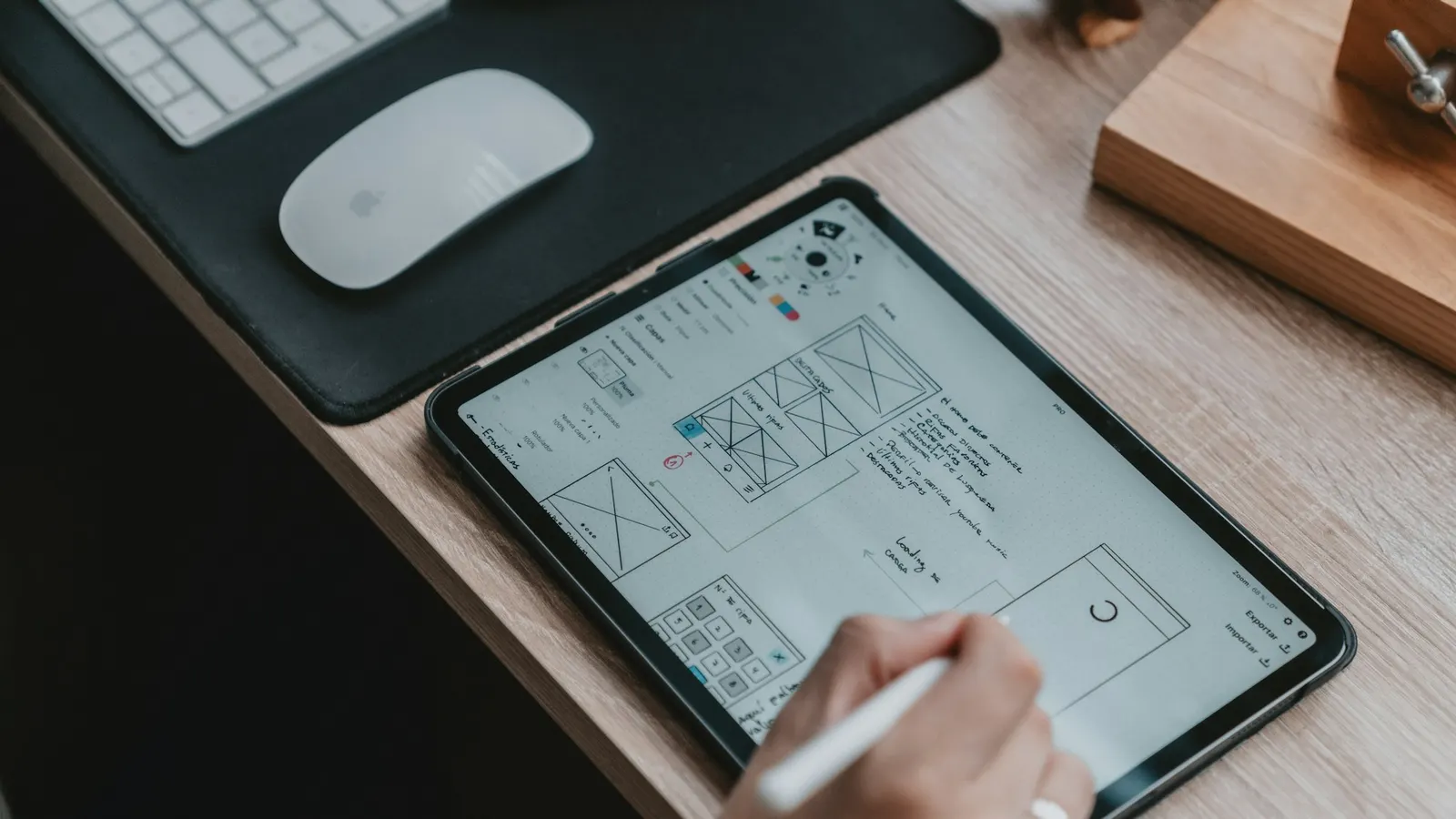 Arabic UX Design: A Practical Guide to RTL Design Done RightWhy mirroring an English design is not enough: RTL rules, bidirectional text, Arabic typography, numerals and Hijri dates, forms and microcopy for Saudi users.
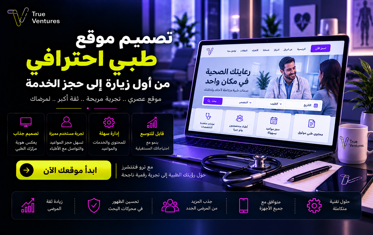 تصميم موقع طبي احترافي: من أول زيارة إلى حجز الخدمةهل يصل المريض إلى خدمتك بسهولة عندما يبحث عنها؟ تصميم موقع طبي احترافي يعرّف الناس بعيادتك، يسهّل اختيار الخدمة والحجز، ويمنح مشروعك حضورًا رقميًا جديرًا بالثقة. ما المقصود بتصميم موقع طبي؟ تصميم موقع طبي هو بناء تجربة…
 ما هو السيو التقني؟ دليلك لتحسين موقعك وتصدر نتائج البحثقد تمتلك محتوى ممتازًا وتصميمًا جذابًا، لكن الأخطاء التقنية قد تمنع موقعك من الظهور. فما هو السيو التقني، وكيف يساعدك على الوصول إلى عملائك؟