

Arabic UX Design: A Practical Guide to RTL Design Done Right
Why mirroring an English design is not enough: RTL rules, bidirectional text, Arabic typography, numerals and Hijri dates, forms and microcopy for Saudi users.

خلاصة المقال
- 01Mirror layout, directional arrows and progress indicators, but never media playback controls, clocks, phone numbers or Latin logos.
- 02Choose a typeface designed for Arabic, set it slightly larger with more line height, and never add letter-spacing or fake italics.
- 03Pick one digit system for display across the whole product, and accept both on input before normalising them.
- 04Test with real Arabic content and Saudi users on their own devices, not with placeholder text or machine translation.
What is Arabic UX design, and why is mirroring not enough?
Arabic UX design means building a product for Arabic-speaking users from the start: right-to-left layouts, proper Arabic typography, local formats for numbers, dates, names and addresses, and copy written in Arabic rather than translated into it. Mirroring an English design flips the layout, but it also flips things that must not flip and leaves typography and content problems untouched.
In Saudi Arabia and the Gulf, Arabic is the language of decision for a large share of users, and a product that feels “translated” loses trust quickly. This guide collects the rules we apply in RTL design: what flips and what does not, bidirectional text, Arabic type, numerals and calendars, forms, microcopy and testing.
RTL design rules: what flips and what must not?
The core rule: anything that expresses reading direction, navigation or progress is mirrored; anything that represents a real-world object or a universally fixed direction stays as it is.
| Element | Mirror? | Note |
|---|---|---|
| Page layout, sidebar and navigation | Yes | Reading starts on the right, so the logo and main navigation move right. |
| Back and next arrows, breadcrumbs | Yes | In an Arabic interface, “back” points right. |
| Progress bars, form steppers, sliders | Yes | Progress fills from right to left. |
| Text alignment and field labels | Yes | Align to the start of the line (right), never a hard-coded left. |
| Media controls (play, fast-forward, rewind) | No | They represent the direction of the media timeline, not reading. |
| Time axes in charts | Usually no | Keep them left to right, as users know from data tools; above all, be consistent across the product. |
| Phone, card and reference numbers | No | Always written left to right and isolated from the surrounding text. |
| Logos and Latin brand names | No | Never mirror a logo or wordmark. |
| Clocks and circular loading indicators | No | Clockwise is universal. |
| Object icons (camera, lock, calendar) | No | Only icons that carry direction flip, such as arrows and the exit icon. |
For implementation, ask your developers to set the page direction and language at the document root and to use CSS logical properties such as margin-inline-start instead of margin-left, so the layout flips automatically between languages without two separate stylesheets.
Bidirectional text: Arabic with English and numbers
Arabic interfaces are rarely pure Arabic: Latin product names, order numbers, email addresses, URLs and mobile numbers all appear inside Arabic sentences. The browser’s bidirectional algorithm handles most cases, but it fails in predictable places:
- Punctuation at the end of a sentence that ends with a Latin word can appear on the wrong side.
- Dynamically inserted values, such as a Latin username inside an Arabic sentence, can scramble the order of neighbouring words.
- Numbers with units or currencies, such as “250 SAR”, can detach from their unit.
The fixes are well known: isolate every dynamic value with the HTML bdi element or Unicode isolate characters, let direction be detected automatically in fields where users may type in either language, and keep email, URL and phone fields left to right. In Arabic text, use the Arabic comma, semicolon and question mark (، ؛ ؟).
Arabic typography: how to choose and set Arabic type
Choose a typeface designed for Arabic
Do not rely on a Latin font falling back to a default system Arabic font; the result is mismatched weights and sizes. Choose a family designed for Arabic with a harmonious Latin companion, and ship the weights you actually use. Popular open-licence options include IBM Plex Sans Arabic, Noto Sans Arabic, Tajawal, Cairo and Readex Pro. Judge them on your real copy at mobile sizes, not on a large display headline.
Set size and spacing
- Size: Arabic looks smaller than Latin at the same font size, so it usually needs to be set somewhat larger, roughly 10 to 20% depending on the typeface. Testing on a device is the final judge.
- Line height: ascenders, descenders, dots and diacritics need room; start at 1.6 to 1.8 for body text.
- No letter-spacing: Arabic letters connect, and any letter-spacing breaks the joins and distorts words.
- No capitals: Arabic has no uppercase, so do not build hierarchy on it; use weight, size and colour.
Avoid fake bold and fake italics
If the real bold weight is not loaded, the browser synthesises one that smudges small letters and dots. Load real weights and ask developers to disable font synthesis. Italics have no established tradition in digital Arabic typography, and a synthetic slant looks broken; use weight or colour for emphasis. Avoid fully justified paragraphs on the web as well; start-aligned text is safer.
Numerals, dates and the Hijri calendar
Western or Eastern Arabic digits?
Both are used in Saudi Arabia: Western digits (0-9) are common in digital products and business, while Eastern Arabic digits (٠-٩) appear in traditional and some official contexts. The key decision is not which, but consistency: pick one system for displaying prices, dates, verification codes and tables, accept both on input and normalise them in the background. Persian digits use different Unicode characters, so handle them too when normalising.
Dates and calendars
- Saudi Arabia’s official Hijri calendar is Umm al-Qura. It is used in many government services and for religious occasions, while the Gregorian calendar dominates business. Show Hijri next to Gregorian where it matters to the user.
- Never convert between calendars by hand; use a trusted library or your platform’s internationalisation APIs that support Umm al-Qura. Remember that the start of Ramadan and Eid is announced officially and can differ by a day from the calculated date.
- In Saudi Arabia the week starts on Sunday and the weekend is Friday and Saturday; configure date pickers and schedules accordingly.
- Use day/month/year order, and the Arabic AM/PM markers (ص / م) in the Arabic interface.
Forms that fit Saudi users: names, mobiles and the national address
- Names: accept Arabic and Latin letters, the space in names such as Abdullah written as two words, and every form of hamza. If you need to match an official document, ask for the name in that exact form, such as the four-part name or the name as on the passport, instead of forcing a Western first/last split.
- Mobile numbers: Saudi mobile numbers start with 5 after the +966 country code, and people type them in many ways (05…, 5…, +9665…, 009665…). Accept them all and normalise to international format.
- National address: it consists of building number, street, district, city, postal code and additional number, and has an 8-character short address (4 letters and 4 digits). Allow the short address or a map pin, and confirm current requirements with SPL if your business depends on it.
- ID numbers: national ID and iqama numbers are 10 digits, starting with 1 and 2 respectively, so you can validate length and prefix instantly.
Ask only for the data you truly need; it is easier for users and lowers your obligations under the Personal Data Protection Law. Short forms that accept local formats are also one of the strongest levers in conversion-focused website design.
Microcopy for Saudi users and bilingual switching
Write copy in Arabic first and derive the English, not the other way round. The tone that usually works is clear, warm and direct Modern Standard Arabic: no heavy bureaucratic formality, and no dense dialect in core interface elements.
- Use local vocabulary: جوال rather than موبايل for “mobile”, and ريال or ر.س for the currency. If you want to use the new Saudi riyal symbol announced in 2025, first check that your fonts and your users’ devices support it.
- Avoid defaulting to masculine commands where you can; verbal-noun forms such as تسجيل الدخول (“sign in”) are neutral and clear.
- Write error messages that explain the fix, such as “Mobile number must start with 5”, not “Invalid input”.
For bilingual switching: put the language toggle in a fixed, visible place, label it in the target language (“English” in the Arabic interface, “العربية” in the English one) rather than with flags, keep users on the same page after switching, and remember their choice. For websites, give each language its own indexable URL, as we explain in our SEO guide for Saudi businesses.
Start in Arabic: in the design projects we deliver at True Ventures, we design core screens in Arabic first and derive the English, because the reverse pushes type, text-length and direction problems to the last minute, when they are most expensive to fix.
Accessibility and testing with real content and users
Accessibility in an Arabic interface starts with basics that are easy to miss: declare the page language correctly so screen readers use an Arabic voice, mark English phrases inside Arabic text with their language, keep keyboard focus order in line with the right-to-left visual order, and ensure sufficient colour contrast, especially since thin Arabic weights degrade quickly at small sizes. Never put Arabic text inside images.
Testing is where most problems surface:
- Real content from day one — design with actual Arabic copy, long names and mixed values, not placeholder text or machine translation.
- Arabic devices — test on devices with Arabic as the system language and an Arabic keyboard, and on a mid-range phone, not only the latest flagship.
- Saudi users — short rounds with a small number of users from your target audience reveal wording and expectation problems the team never notices.
- Pre-launch review — include RTL, mixed-text and numeral cases in your software testing plan, not in ad-hoc notes after launch.
Common mistakes: mirrored video controls or logos, letter-spaced Arabic headlines, a default system Arabic font next to a carefully chosen Latin one, both digit systems on the same screen, arrows that do not flip in the Arabic interface, and fields that reject Arabic names or Eastern Arabic digits.
An Arabic-speaking user should never feel they are using a translation.
Arabic UX checklist
- Direction and language are set at the page root, and styling uses logical properties.
- Arrows and progress indicators flip; media controls, clocks, logos and numbers do not.
- Dynamic values and Latin text are isolated from Arabic text.
- A real Arabic typeface in its real weights, with no letter-spacing or fake italics.
- One digit system on display; both accepted on input.
- Calendar, week start, and date and time formats suit Saudi users.
- Name, mobile and address fields accept local formats.
- Copy is written in Arabic first and tested with real users.
If you are building a digital product for Arabic-speaking users or want an existing interface reviewed, explore our design services, or get in touch and we will review your key screens with you and identify what to fix first.
أسئلة وأجوبة
01Is enabling RTL direction enough to support Arabic?
No. Setting the direction flips the overall layout, but it does not choose a suitable Arabic typeface, fix mixed Arabic and English text, or stop elements such as video controls and logos from being mirrored when they should not be. The content itself also needs native Arabic writing and local formats for numbers, dates and forms.
02What is the best Arabic font for websites and apps?
There is no single best font. A good choice is designed for Arabic, offers the weights you need, pairs well with a Latin companion, stays legible at small mobile sizes and has a licence that covers web and app use. Compare two or three candidates on your real copy and screens before you decide.
03Should an Arabic app use Western or Eastern Arabic digits?
Both are acceptable in Saudi Arabia; what matters is consistency within the product. Western digits are common in apps and e-commerce, while Eastern Arabic digits feel familiar in more traditional contexts. Choose one for display on every screen, and make input fields accept and normalise both so mobile numbers and verification codes never fail.
04Do I need separate designs for the Arabic and English versions?
Usually not. You need one design system that supports both directions, with core screens actually designed and reviewed in Arabic. Some elements still need language-specific treatment, such as long headlines, illustrations that imply direction and images that contain text. Plan for these cases in the design system from the start.
حوّل هذا الدليل إلى خطة.
أخبرنا أين تقف اليوم، وسيرسم فريقنا معك الخطوات التالية — بدءًا من Design services.
الطريقة الأسرع
عندك سؤال؟ اسألنا على الواتساب.
أخبرنا بما تخطط له وسيوجهك فريقنا إلى الشخص المناسب — دون تعبئة أي نموذج.
نرد عادةً خلال دقائق في أوقات العمل.
More guides for you
كل الأدلة Conversion-Focused Website Design: A Practical Guide for the GulfHow to turn your website into a sales asset: one goal per page, a message that lands in five seconds, local trust signals, speed, shorter forms and honest measurement.
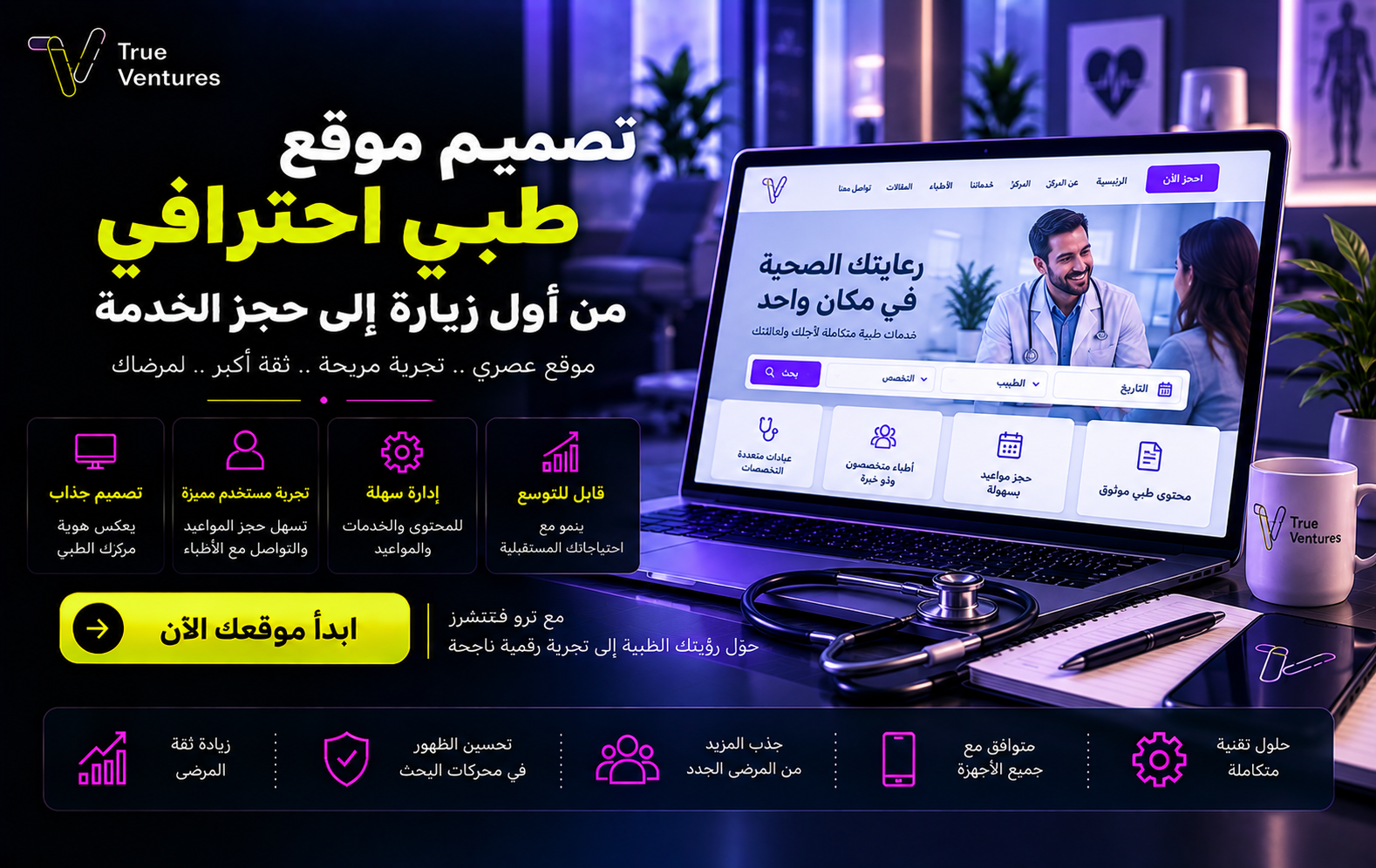 تصميم موقع طبي احترافي: من أول زيارة إلى حجز الخدمةهل يصل المريض إلى خدمتك بسهولة عندما يبحث عنها؟ تصميم موقع طبي احترافي يعرّف الناس بعيادتك، يسهّل اختيار الخدمة والحجز، ويمنح مشروعك حضورًا رقميًا جديرًا بالثقة. ما المقصود بتصميم موقع طبي؟ تصميم موقع طبي هو بناء تجربة…
 ما هو السيو التقني؟ دليلك لتحسين موقعك وتصدر نتائج البحثقد تمتلك محتوى ممتازًا وتصميمًا جذابًا، لكن الأخطاء التقنية قد تمنع موقعك من الظهور. فما هو السيو التقني، وكيف يساعدك على الوصول إلى عملائك؟